GitHub Page
Pandas-via-psql (ppsqlviz) is a command line visualization utility for SQL using Pandas library in Python. Please visit the GitHub page ppsqlviz for a complete tutorial.
PSQL + Pandas Awesomeness
Pandas is a popular library in Python that is commonly used for data analysis and it provides Python equivalent of the R dataframe that is fundamental to data analysis. Some engineers and data scientists however are increasingly adopting SQL based libraries for building large scale machine learning algorithms. MADlib is one such library for scalable, parallel, in-database machine learning.
While there are commercial tools to visualize data that reside in databases (example: Tableau), often what's missing in a Big Data scientist's arsenal is a command line tool to be able to quickly visualize the output of a SQL query, without having to switch to a commercial tool or have to use a wrapper to a SQL engine. The pandas_via_psql (ppsqlviz) will show you how simple it is to redirect the output of a SQL query to some boilerplate Pandas's plotting functions, to quickly visualize the data from the command line.
Pre-Requisites
ppsqlviz depends on the Pandas python library. You should also have PSQL or a similar SQL command line interface to connect to your database and also ensure that you have password-less access to your remote database (set up SSH keys appropriately).
I recommend you download Anaconda Python from the nice folks at Continuum Analytics. It's got most of the essential Python scientific computing libraries pre-packaged and with conda you can save a lot of pain in installing python libraries. It also makes creating and managing virtual environments a piece of cake!
Installation
You can install install ppsqlviz through pip
pip install ppsqlviz
This will install the dependent library (Pandas) if you don't already have that. I strongly encourage you use Anaconda Python to avoid going down the rabbit hole of PyData stack dependency nightmares.
Datasets Used
For this demo, I'm using two publicly available datasets.
- The UCI wine quality dataset - Here is a sampling of rows from this dataset:
alcohol | mmalic_acid | ash  | alcalinity_of_ash | magnesium | total_phenols | flavanoids | nonflavanoid_phenols | proanthocyanins | color_intensity |  hue  | od280 | proline | quality
---------+-------------+------+-------------------+-----------+---------------+------------+----------------------+-----------------+-----------------+-------+-------+---------+---------
       1 |       14.23 | 1.71 |              2.43 |      15.6 |           127 |        2.8 |                 3.06 |            0.28 |            2.29 |  5.64 |  1.04 |    3.92 |    1065
       1 |        13.2 | 1.78 |              2.14 |      11.2 |           100 |       2.65 |                 2.76 |            0.26 |            1.28 |  4.38 |  1.05 |     3.4 |    1050
       1 |       13.16 | 2.36 |              2.67 |      18.6 |           101 |        2.8 |                 3.24 |             0.3 |            2.81 |  5.68 |  1.03 |    3.17 |    1185
       1 |       14.37 | 1.95 |               2.5 |      16.8 |           113 |       3.85 |                 3.49 |            0.24 |            2.18 |   7.8 |  0.86 |    3.45 |    1480
       1 |       13.24 | 2.59 |              2.87 |        21 |           118 |        2.8 |                 2.69 |            0.39 |            1.82 |  4.32 |  1.04 |    2.93 |     735
       1 |        14.2 | 1.76 |              2.45 |      15.2 |           112 |       3.27 |                 3.39 |            0.34 |            1.97 |  6.75 |  1.05 |    2.85 |    1450
       1 |       14.39 | 1.87 |              2.45 |      14.6 |            96 |        2.5 |                 2.52 |             0.3 |            1.98 |  5.25 |  1.02 |    3.58 |    1290
       1 |       14.06 | 2.15 |              2.61 |      17.6 |           121 |        2.6 |                 2.51 |            0.31 |            1.25 |  5.05 |  1.06 |    3.58 |    1295
       1 |       14.83 | 1.64 |              2.17 |        14 |            97 |        2.8 |                 2.98 |            0.29 |            1.98 |   5.2 |  1.08 |    2.85 |    1045
       1 |       13.86 | 1.35 |              2.27 |        16 |            98 |       2.98 |                 3.15 |            0.22 |            1.85 |  7.22 |  1.01 |    3.55 |    1045
       1 |        14.1 | 2.16 |               2.3 |        18 |           105 |       2.95 |                 3.32 |            0.22 |            2.38 |  5.75 |  1.25 |    3.17 |    1510
       1 |       14.12 | 1.48 |              2.32 |      16.8 |            95 |        2.2 |                 2.43 |            0.26 |            1.57 |     5 |  1.17 |    2.82 |    1280
       1 |       13.75 | 1.73 |              2.41 |        16 |            89 |        2.6 |                 2.76 |            0.29 |            1.81 |   5.6 |  1.15 |     2.9 |    1320
       1 |       14.75 | 1.73 |              2.39 |      11.4 |            91 |        3.1 |                 3.69 |            0.43 |            2.81 |   5.4 |  1.25 |    2.73 |    1150
       1 |       14.38 | 1.87 |              2.38 |        12 |           102 |        3.3 |                 3.64 |            0.29 |            2.96 |   7.5 |   1.2 |       3 |    1547
       1 |       13.63 | 1.81 |               2.7 |      17.2 |           112 |       2.85 |                 2.91 |             0.3 |            1.46 |   7.3 |  1.28 |    2.88 |    1310
- The S&P daily prices dataset - Here is a sampling of rows from this dataset:
     dt     |  open   |  high   |   low   |  close  |   volume   | adj_close
------------+---------+---------+---------+---------+------------+-----------
 2013-09-27 | 1695.52 | 1695.52 | 1687.11 | 1691.75 | 2951700000 |   1691.75
 2012-04-23 | 1378.53 | 1378.53 | 1358.79 | 1366.94 | 3654860000 |   1366.94
 2012-01-18 | 1293.65 | 1308.11 | 1290.99 | 1308.04 | 4096160000 |   1308.04
 2011-09-07 | 1165.85 | 1198.62 | 1165.85 | 1198.62 | 4441040000 |   1198.62
 2011-06-03 | 1312.94 | 1312.94 |  1297.9 | 1300.16 | 3505030000 |   1300.16
 2011-03-31 | 1327.44 | 1329.77 | 1325.03 | 1325.83 | 3566270000 |   1325.83
 2010-12-28 |  1259.1 |  1259.9 | 1256.22 | 1258.51 | 2478450000 |   1258.51
 2010-09-23 |  1131.1 | 1136.77 | 1122.79 | 1124.83 | 3847850000 |   1124.83
 2010-07-21 | 1086.67 | 1088.96 | 1065.25 | 1069.59 | 4747180000 |   1069.59
 2010-05-13 | 1170.04 | 1173.57 | 1156.14 | 1157.44 | 4870640000 |   1157.44
 2010-03-10 | 1140.22 | 1148.26 | 1140.09 | 1145.61 | 5469120000 |   1145.61
 2009-12-04 | 1100.43 | 1119.13 | 1096.52 | 1105.98 | 5781140000 |   1105.98
 2009-07-24 |  972.16 |  979.79 |  965.95 |  979.26 | 4458300000 |    979.26
 2009-02-09 |  868.24 |  875.01 |  861.65 |  869.89 | 5574370000 |    869.89
 2008-11-05 | 1001.84 | 1001.84 |  949.86 |  952.77 | 5426640000 |    952.77
 2008-09-02 | 1287.83 | 1303.04 |  1272.2 | 1277.58 | 4783560000 |   1277.58
 2008-04-30 | 1391.22 | 1404.57 | 1384.25 | 1385.59 | 4508890000 |   1385.59
 2008-01-25 | 1357.32 | 1368.56 |  1327.5 | 1330.61 | 4882250000 |   1330.61
 2007-09-14 | 1483.95 | 1485.99 | 1473.18 | 1484.25 | 2641740000 |   1484.25
Usage
Invoke Pandas plotting functions by piping in the output from a psql query. You can re-use this boiler-plate code for Scatter Plots, Box Plots, Histograms and Time Series Plots on your tables.
Scatter Matrix
This is pretty useful when you are interested in analyzing the correlation between a bunch of features in a dataset, particularly in their correlation with the target attribute/label. You might then perform feature selection based on a visual output of the correlations.
Here is how the scatter matrix can be created on the UCI Wine Quality Dataset
home$ psql -d vatsandb -h dca -U gpadmin -c 'select * from wine;' | python -m 'ppsqlviz.plotter' scatter
Here is the output 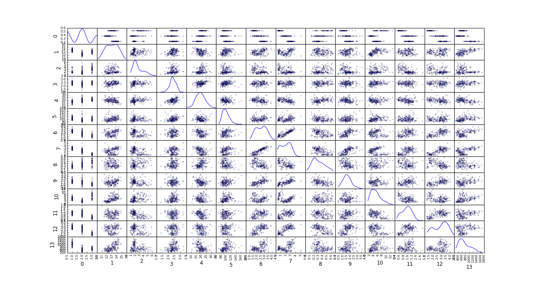
Hexbin Plots
Scatter plots sometimes may not reveal the underlying relationship between the dimensions when multiple points overlap.
For this reason, it is better to look at a 2-d histogram or a hex-bin plot. We can tap into matplotlib's hexbin plot for this.
You could invoke it from your command line like so:
home$ psql -d vatsandb -h dca -U gpadmin -c 'select ash, flavanoids from wine;' | python -m 'ppsqlviz.plotter' hexbin
Here is the output 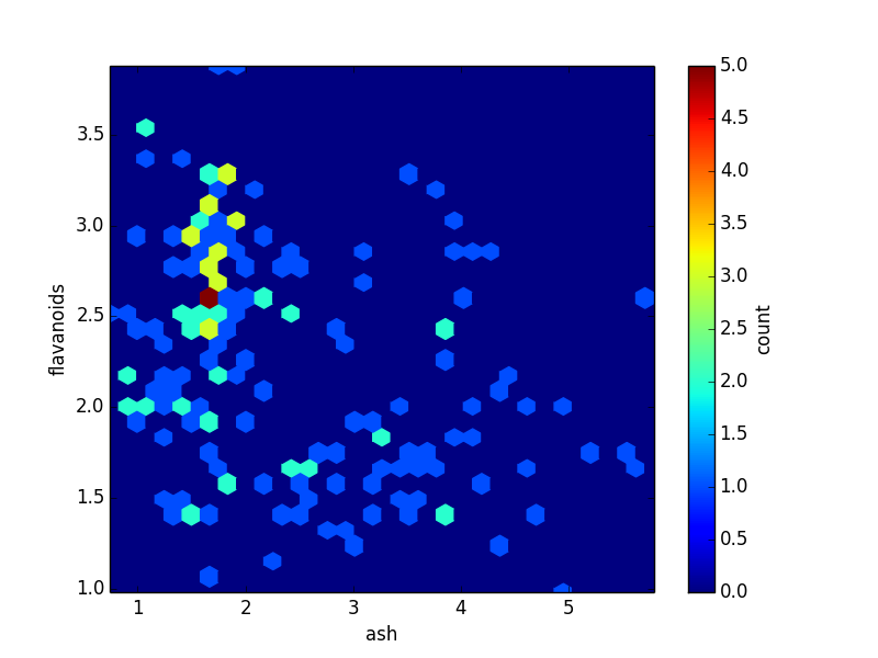
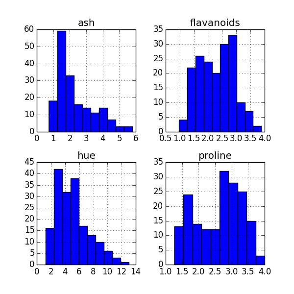
Histogram Plot
To get a quick glimpse of the distribution of the data in your columns, a histogram plot of all columns is quite useful.
You could invoke it from your command line like so:
home$ psql -d vatsandb -h dca -U gpadmin -c 'select ash, flavanoids, hue, proline from wine;' | python -m 'ppsqlviz.plotter' hist
Here is the output
Density Plot
In place of binning your data, you might consider plotting the density directly.
You could invoke it from your command line like so:
home$ psql -d vatsandb -h dca -U gpadmin -c 'select ash, flavanoids, hue, proline from wine;' | python -m 'ppsqlviz.plotter' density
Here is the output 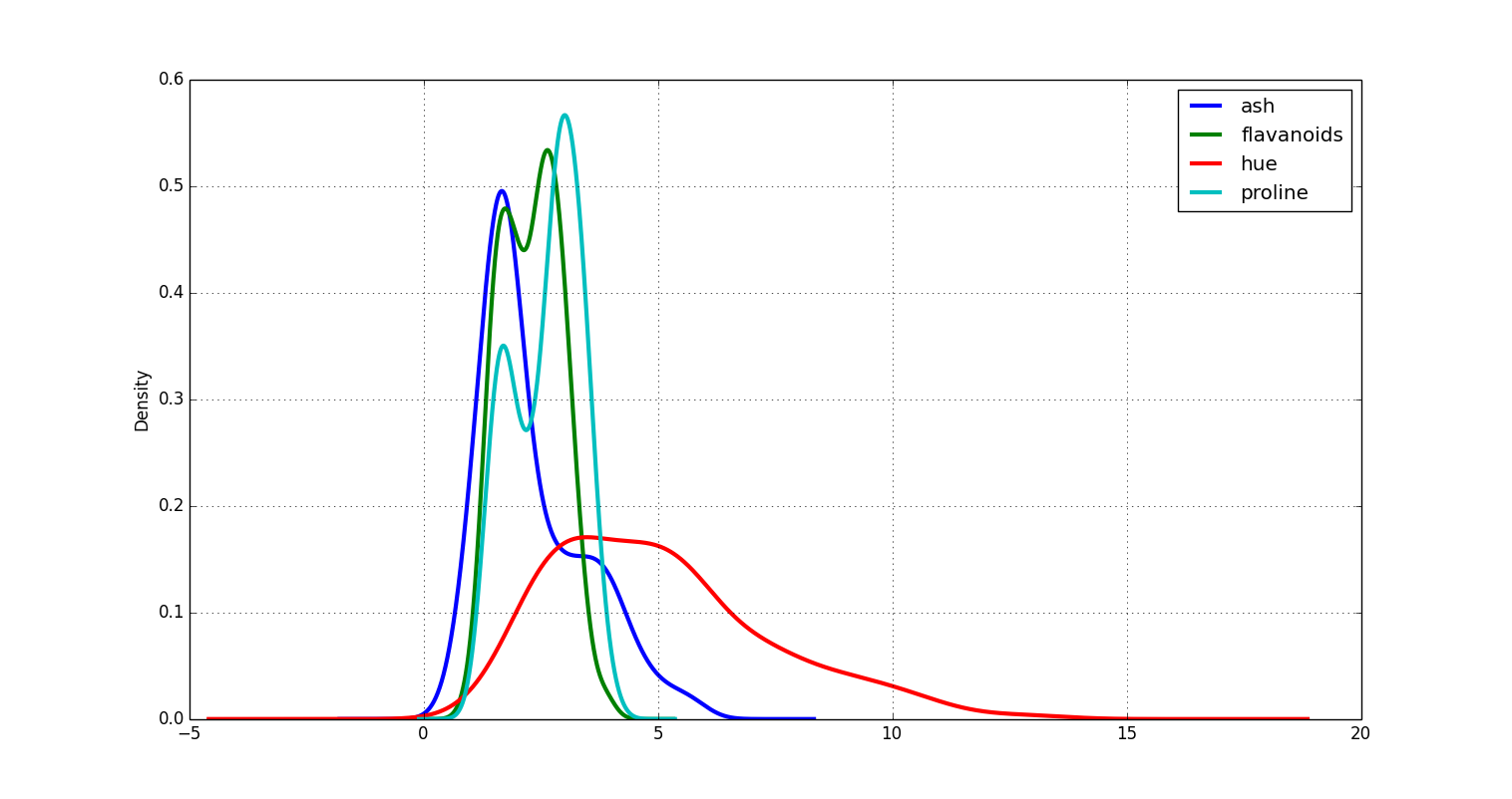
Box Plot
Box plots are useful in visually getting a feel for the quartile ranges of numerical columns in your dataset. You could invoke it from your command line like so:
home$ psql -d vatsandb -h dca -U gpadmin -c 'select ash, flavanoids, hue, proline from wine;' | python -m 'ppsqlviz.plotter' box
Here is the output 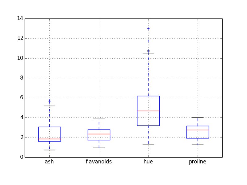
Time Series Plot
Again, Pandas has an impressive collection of functions for time series analysis but to quickly visualize a time series, you can run the following from your command line:
home$ psql -d vatsandb -h dca -U gpadmin -c 'select dt, high, low from sandp_prices where dt > 1998 order by dt;' | python -m 'ppsqlviz.plotter' tseries
Here is the output 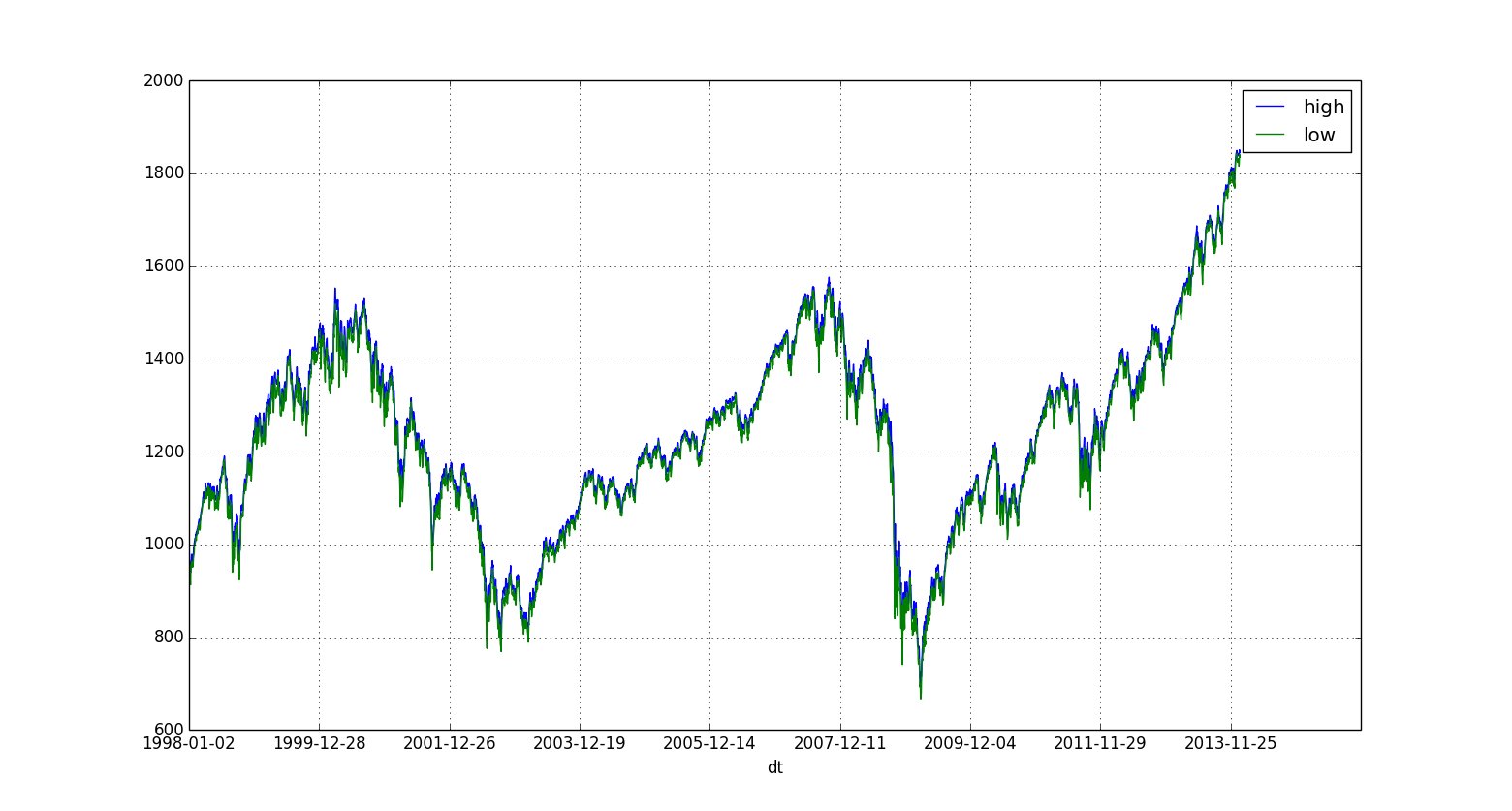
Bar Plot
Bar plots are typically used to plot binned data, where the data is binned according to user specified bins. This support is provided in pandas-via-psql. The data table is expected to comprise of two array columns of the same length, one each for the x and y axes. You can plot a bar plot by running the following from your command line:
home$ psql -d <dbname> -h <hostname> -U gpadmin -c 'select x*10 as binCenter, random()*100 as count from generate_series(1, 100) x;' | python -m 'ppsqlviz.plotter' bar
The first column always has to be the x axis (bin center).
Here's the output 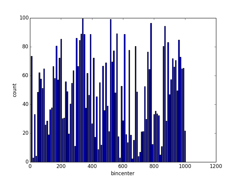
Image Rendering
Pandas also has a great set of tools for viewing images: grayscale or RGB, which can be quite handy when working on image processing or computer vision in SQL. For example, to check a binary mask after thresholding or the weights output by a deep learning algorithm, it is much easier to visualize an image than to interpret a table of intensity values. To view an image whose intensity values are stored in a table, simply select the height and width of the image (number of rows & columns) followed by a vector of intensity values ordered by row, then column. For example, to view this 270x360 pixel grayscale image, you can run the following from your command line:
home$ psql -d vatsandb -h dca -U gpadmin -c 'select 270 as rows, 360 as cols, intensity_values from sample_image;' | python -m 'ppsqlviz.plotter' image
Here is the output 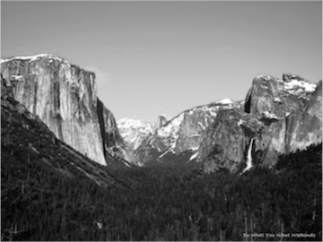
Similarly, to view an RGB image, provide the image height and width followed by a vector of intensity values ordered by row, then column, then color. To view a sample RGB image you can run the following from your comman line:
home$ psql -d vatsandb -h dca -U gpadmin -c 'select max(row)+1, max(col)+1, array[array_agg(red_intensity order by row,col), array_agg(green_intensity order by row,col), array_agg(blue_intensity order by row,col)] from (select * from sample_RGB_image order by row,col)t;' | python -m 'ppsqlviz.plotter' imageRGB
Here is the output 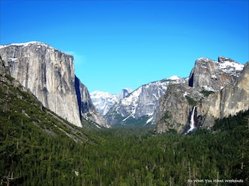
Author
Please email questions and feedback to Srivatsan Ramanujam at vatsan.cs@utexas.edu
Contributors
Thanks to Ailey Crow and Gautam Muralidhar for their contributions.